Creating Better Navigation with Tailwind in Astro
Published: Mar 11 2024

Updating the nav
For an airport lounge build, the nav I had orginally built was good enough. However, with tailwind and Shadcn-ui at my disposal, I knew I could do better. The recipe for a good blog, is not just great content, but also an appealing look and feel. Thus I thought of making everything look good before I moved on to new features. I like the mobile responsive navigation, with the exception of I don’t like the way it pushes down content, instead of sliding over it. We will correct that, but what I really don’t like is the desktop view where everything is left justified. It just doesn’t look right and I’m going to fix it.
Original Code
Here was the code for my original design. It was ok, but didn’t really look right to me. I want to use the whole viewport when I’m in desktop mode and obviously a responsive mode when on mobile.
import { useState } from "react"
import { Search, Menu } from "lucide-react"

export default function Navbar() {

    const [state, setState] = useState(false)

    const menus = [
        {title: "home", path: "/"},
        {title: "blog", path: "/posts"},
        {title: "about", path: "/about"},
        {title: "contact", path: "/contact"}
    ]
    return (
        <nav className="bg-white w-full border-b md:border-0">
            <div className="items-center px-4 max-w-screen-xl max-auto md:flex md:px-8">
                <div className="flex items-center justify-between py-3 md:py-5 md:block">
                    <a href="/">
                        <h1 className="text-3xl font-bold text-blue-800">Site Title Here</h1>
                    </a>
                    <div className="md:hidden">
                        <button className="text-gray-700 outline-none p-2 rounded-md focus:border-gray-400 focus:border" onClick={() => setState(!state)}>
                            <Menu/>
                        </button>
                    </div>
                </div>
                <div className={`flex-1 justify-self-center md:justify-between pb-3 mt-8 md:block md:pb-0 md:mt-0 ${state ? "block" : "hidden"}`}>
                    <ul className="justify-center items-center space-y-8 md:flex md:space-x-6 md:space-y-0">
                        {menus.map((item, idx) => (
                            <li key={idx} className="text-gray-600 hover:text-orange-300">
                                <a href={item.path}>{item.title}</a>
                            </li>
                        ))}
                        <form className="flex items-center space-x-2 border rounded-md p-2 justify-end">
                            <Search className="h-5 w-5 flex-none text-gray-300" />
                            <input
                                className="w-full outline-none appearance-none placeholder-gray-500 text-gray-500 sm:w-auto"
                                type="text"
                                placeholder="Search"
                            />
                        </form>
                    </ul>

                </div>
            </div>
        </nav>
    )
}
Updated Look
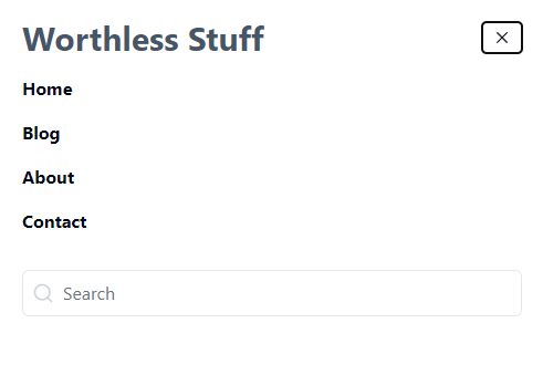
After a fair amount of tinkering with Tailwind and my component, I ended up getting exactly what I wanted. I wanted the site name on the left the main navigation in the middle (with room to grow) and a search bar on the far right.

Although you may be able to tell, I also updated the way the mobile navigation looks as well.

The NEW code
import {Search, Menu} from 'lucide-react'
import { useState } from 'react'
export default function Header() {

    const [isOpen, setIsOpen] = useState(false)

    const menus = [
        {title: "Home", path: "/"},
        {title: "Blog", path: "/posts"},
        {title: "About", path: "/about"},
        {title: "Contact", path: "/contact"}
    ]

    return (
<nav className="flex items-center justify-between flex-wrap p-6">
     <div className="flex items-center flex-shrink-0 text-slate-700 text-3xl mr-6 lg:mr-72">
        <a href="/"><h1 className='font-sans font-bold text-slate-600'>Site Title Here</h1></a>
     </div>
     <div className="block lg:hidden">
       <button
         onClick={() => setIsOpen(!isOpen)}
         className="flex items-center px-3 py-2 rounded text-black-500 hover:text-black-400"
       >
         <svg
           className={`fill-current h-3 w-3 ${isOpen ? "hidden" : "block"}`}
           viewBox="0 0 20 20"
           xmlns="http://www.w3.org/2000/svg"
         >
           <path d="M0 3h20v2H0V3zm0 6h20v2H0V9zm0 6h20v2H0v-2z" />
         </svg>
         <svg
           className={`fill-current h-3 w-3 ${isOpen ? "block" : "hidden"}`}
           viewBox="0 0 20 20"
           xmlns="http://www.w3.org/2000/svg"
         >
           <path d="M10 8.586L2.929 1.515 1.515 2.929 8.586 10l-7.071 7.071 1.414 1.414L10 11.414l7.071 7.071 1.414-1.414L11.414 10l7.071-7.071-1.414-1.414L10 8.586z" />
         </svg>
       </button>
     </div>
     <div
       className={`w-full block flex-grow lg:flex lg:items-center lg:w-auto ${isOpen ? "block" : "hidden"}`}
     >
       <div className="mx-auto items-center">
        {menus.map((item,idx) => (<a href={item.path} className="block mt-4 lg:inline-block lg:mt-0 font-bold md:hover:font-extrabold mr-4 md:hover:underline" key={idx}>{item.title}</a>))}
       </div>
       <div className='py-8 lg:ml-72'>
       <form className="flex items-center space-x-2 border rounded-md p-2 justify-end">
                            <Search className="h-5 w-5 flex-none text-gray-300" />
                            <input
                                className="w-full outline-none appearance-none placeholder-gray-500 text-gray-500 sm:w-auto"
                                type="text"
                                placeholder="Search"
                            />
                    </form>
       </div>
     </div>
   </nav>
    )
}
I’m not sure if I’ll change the behavior of the mobile navigation. At first I wanted it to pop over the content below it. How it works right now, is that it pushes content down. The advantage of this is that content is still viewable. I’m not sure if it really matters or not. If you have an opinion, I’m more than happy to listen.
Now I feel I have a much better looking blog and more user friendly. The next step is to get the ordering to work on the blog archive page. Right now it’s ascending order and I need it reversed.
We will cover that in the next post.